

Billboard design best practices and examples
Billboards are one of the most popular and effective ways for brands to communicate their message to large audiences – but buying the space is only half the job.
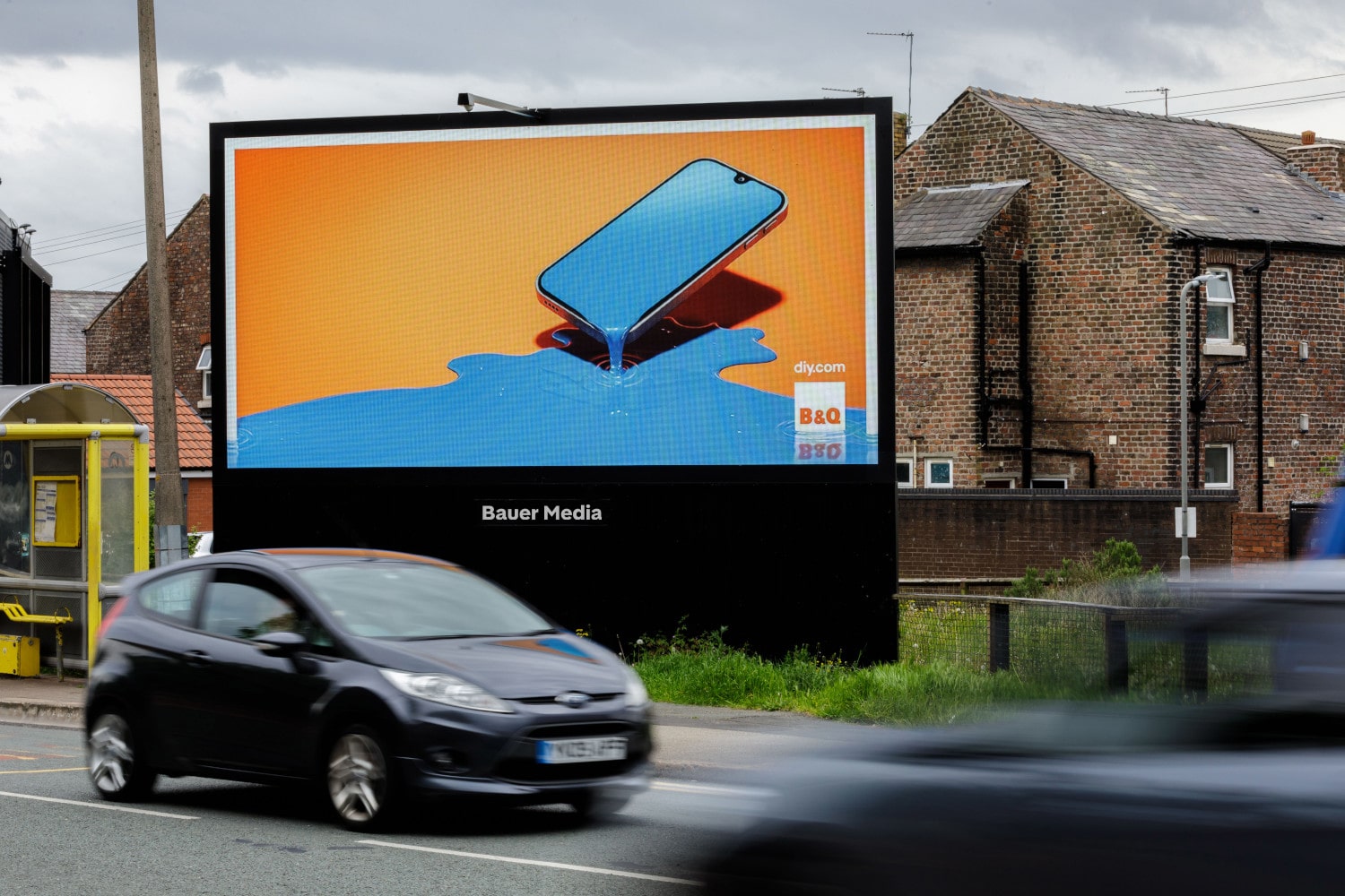
Paying little attention to the creative simply won't cut it. To make the most of billboard advertising, knowing the fundamental rules of billboard design is imperative – from the basics of what makes a billboard work to real examples of it done well.
Let's start with the basics. The best billboard designs tend to follow the same simple but crucial rules:
It's a lot easier to appreciate why our billboard design rules are important when you can see them in practice. So, we've pulled together some of the most effective billboards we've seen recently and analysed what makes them work so well.
This Valentine's Day ad for contact lenses from Specsavers plays on an all-too-familiar experience for glasses-wearers: having your frames get in the way of a romantic moment.
Rather than showing whole-body shots, the designer has magnified the models' faces and kept the focus where it needs to be. The text is cleverly positioned to emphasise the message it conveys and, along with Specsavers' highlighted logo, makes immediately clear who the intended audience is.
-min.jpg)
Flora leveraged the crossover between New Year's resolutions and Veganuary to promote their plant-based butter. As part of a wider campaign, they opted to utilise our iconic Storm Cromination site, which is comprised of six digital billboards.
Despite the scale of Storm Cromination, note how Flora weren't tempted to use a more complex design. By sticking to a plain white background and black text formula, they made sure that drivers would be able to comprehend their message. The only use of colour is an image of the product – another smart choice that helps to draw attention to the actionable element.
An excellent example of how to design a billboard ad comes from Reed.co.uk. Using just seven words, the brand has captured one of the most motivating forces in life – job satisfaction. From the bright pink background to the inspirational CTA copy, the tone is of sheer joy.
Humans are inclined to notice other humans, so including images of people in your creative is a cheat code for diverting attention towards your billboard. We also tend to mimic each other's emotions, which is why the image of a person smiling and dancing stirs up similar emotions in the viewer.
-min.jpg)
Now that we have the basics of good billboard design covered, it's time to think about the deeper dynamics at play. All of the examples above work because they have been designed with the audience front of mind. Using this technique is what's most likely to influence the success of your billboard campaign.
Here are our top design tips for making sure that your billboard resonates with its target audience:
Designing a billboard can be both a fun and rewarding process. Just take a look at some of our favourite examples of creative and iconic billboards – you'll no doubt come away with loads of billboard design ideas bubbling in your mind.
To discuss setting up a billboard campaign and receive some bespoke design advice, get in touch with us today.
Optional text area